St Piste-ers 2027 · Design selection
Five directions. Pick the one people will love opening.
Each concept renders the same trip, the same participant (Hannah) and the same organiser data, so you are comparing design, not content. Open them on your phone as well as a laptop — the mobile layouts are designed separately, not shrunk. All prices are demo figures.
- Skim the five cards below.
- Open each concept’s participant home and command centre on your phone.
- Tell us which direction to build — or which elements to combine.
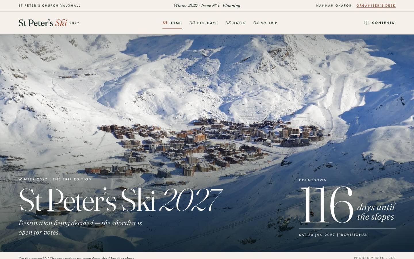
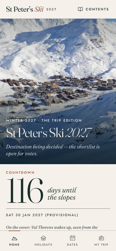
Concept A
Alpine Editorial
A winter magazine you happen to plan a trip in.
Reads like a premium European ski annual: high-contrast serif headlines, warm paper surfaces, full-bleed photography with captions and credits. Every screen is laid out as a numbered feature, so the trip feels anticipated rather than administered. Calm, confident and grown-up, with a single rust accent for the things that need you.
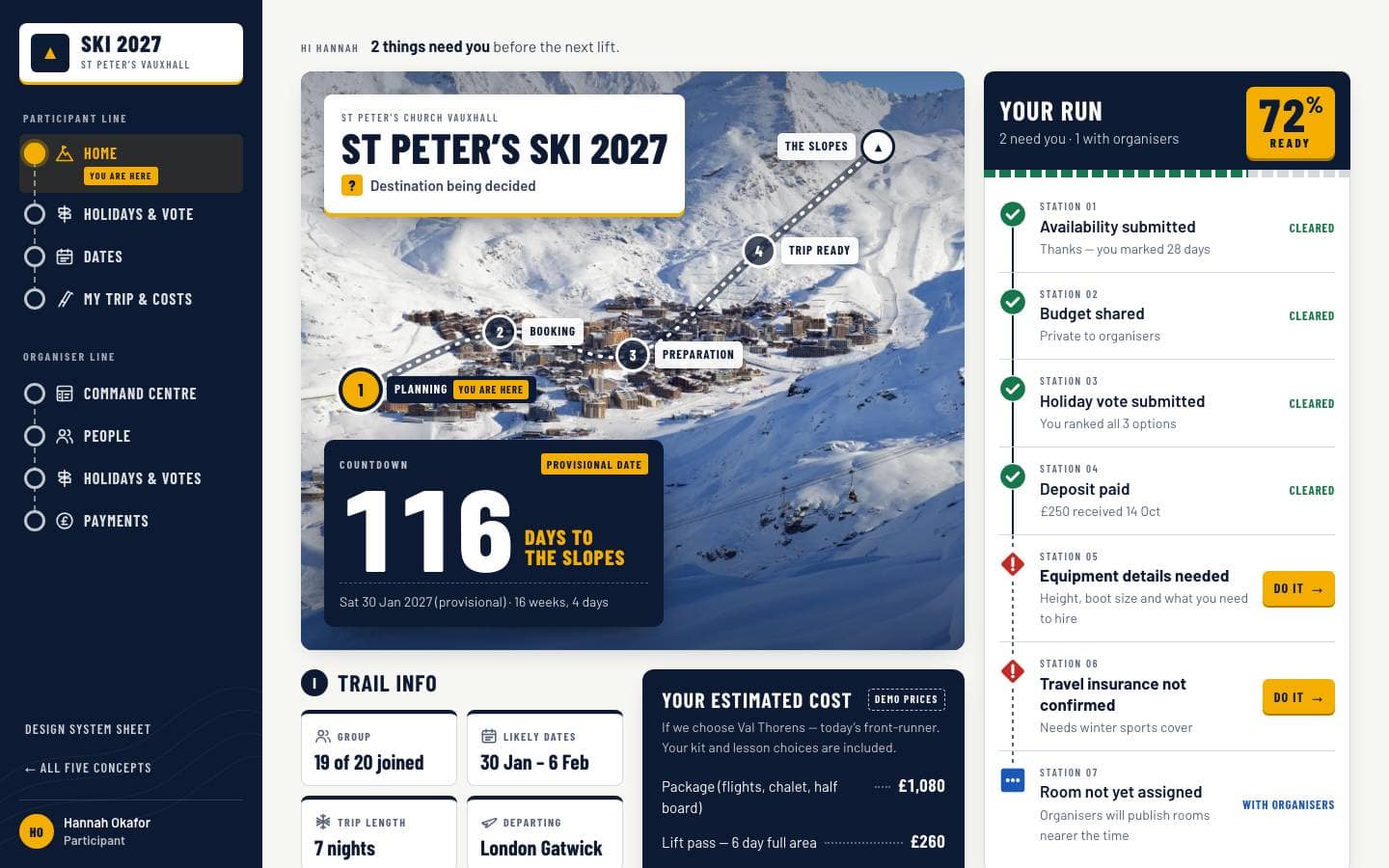
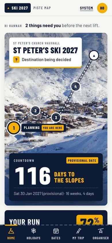
Concept B
Piste Map
Your trip, signposted like a mountain.
Borrowed from trail maps and resort wayfinding: every task is a station on your run, progress is a route line, and status uses real piste-marker shapes so nothing relies on colour alone. Condensed signage type and a navy-and-snow palette keep it crisp, functional and a little bit playful.
Concept C
Après Modern
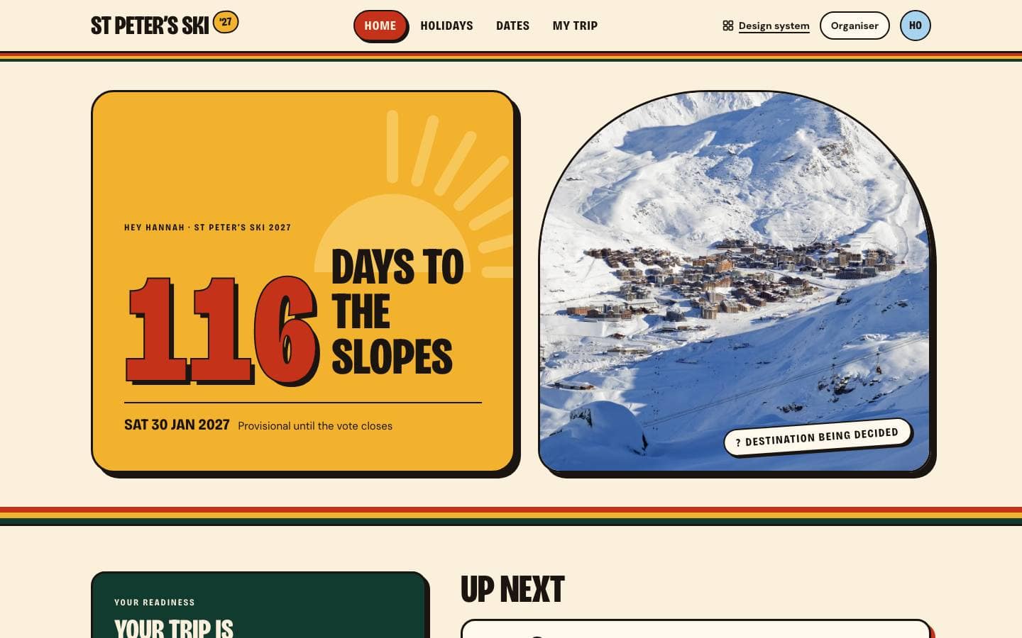
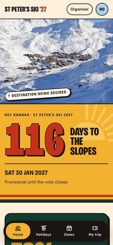
116 days to the slopes. Let’s go.
An energetic ski-travel brand for a group in their twenties: huge condensed poster type, confident blocks of chairlift red, sunflower and pine, and chunky sticker-like cards with hard offset shadows. Retro-alpine stripes and sunbursts give it personality, while a floating pill tab bar keeps the phone experience one-thumb simple.
Concept D
Nordic Minimal
Snow, stone and quiet confidence.
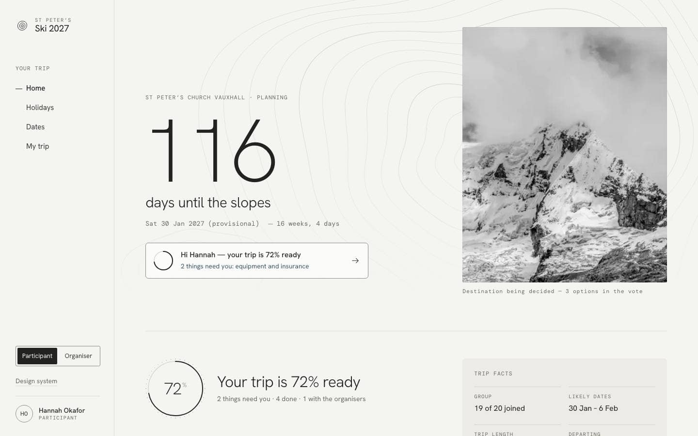
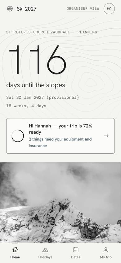
A calm Scandinavian take on the trip: near-monochrome snow and stone, light grotesk type with mono metadata, and hand-drawn contour lines instead of decoration. Photography stays black and white until the destination is chosen, so colour is earned. Everything is list-led and revealed progressively, which makes the organiser view feel composed rather than busy.
Concept E
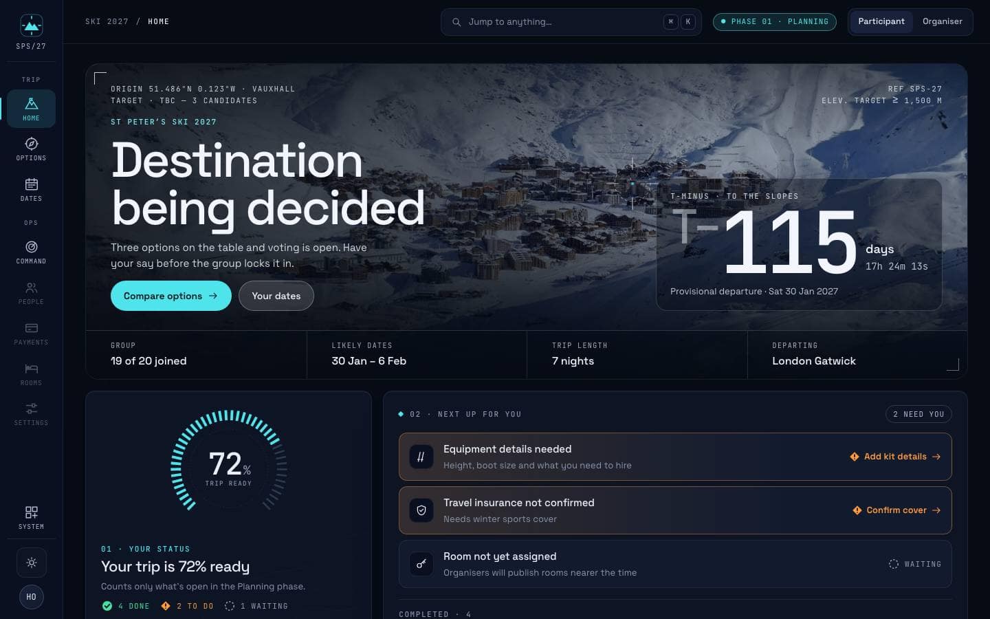
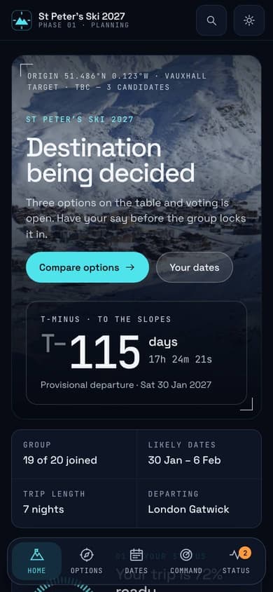
Alpine OS
Mission control for the mountains.
A premium outdoor-tech interface — think high-end GPS watch meets avalanche-transceiver UI. Modular panels, crisp mono readouts, segmented gauges and topographic contours make the organiser view ruthlessly clear, while a live T-minus countdown and graded, HUD-framed photography keep it exciting for everyone else. Dark mountain-night by default, with a crisp light mode.